
Color Psychology: Choosing Hues for Impact

Have you ever walked into a store and felt instantly calm and relaxed? Or been energized by a brand's logo or website? It's no coincidence. Colors have a powerful effect on our emotions and behavior, and businesses leverage this power through color psychology in branding.
This is your guide to unlocking the emotional impact of colors and choosing the perfect hues to resonate with your target audience. We'll delve into the psychology of common colors, explore real-world examples, and provide actionable tips to elevate your brand identity.
The Science Behind Color
Our brains are wired to react to colors. When we see a specific color, it triggers the release of hormones and neurotransmitters, influencing our mood, energy levels, and even purchasing decisions. Studies have shown that up to 90% of a customer's first impression of a product is based on color alone (Source: HubSpot blog on Color Psychology)
So, how can you harness this power to create a brand that speaks volumes? Let's explore the language of colors:
The Calming Blues and Trustworthy Greens

Imagine a tranquil ocean scene. What colors come to mind? Most likely, shades of blue and green. Blue is a universally recognized color of peace, security, and reliability. Think calming apps or meditation spaces that often incorporate blue hues to create a sense of serenity. Businesses like PayPal and Facebook utilize blue to project an image of trust and stability in their financial transactions and social connections, respectively.
Green, often associated with nature, evokes feelings of growth, health, and harmony. Environmental and organic brands naturally gravitate towards greens. Imagine a logo for a yoga studio or a health food store. Both could benefit from the calming and restorative properties of green.
The Energetic Reds and Zesty Oranges
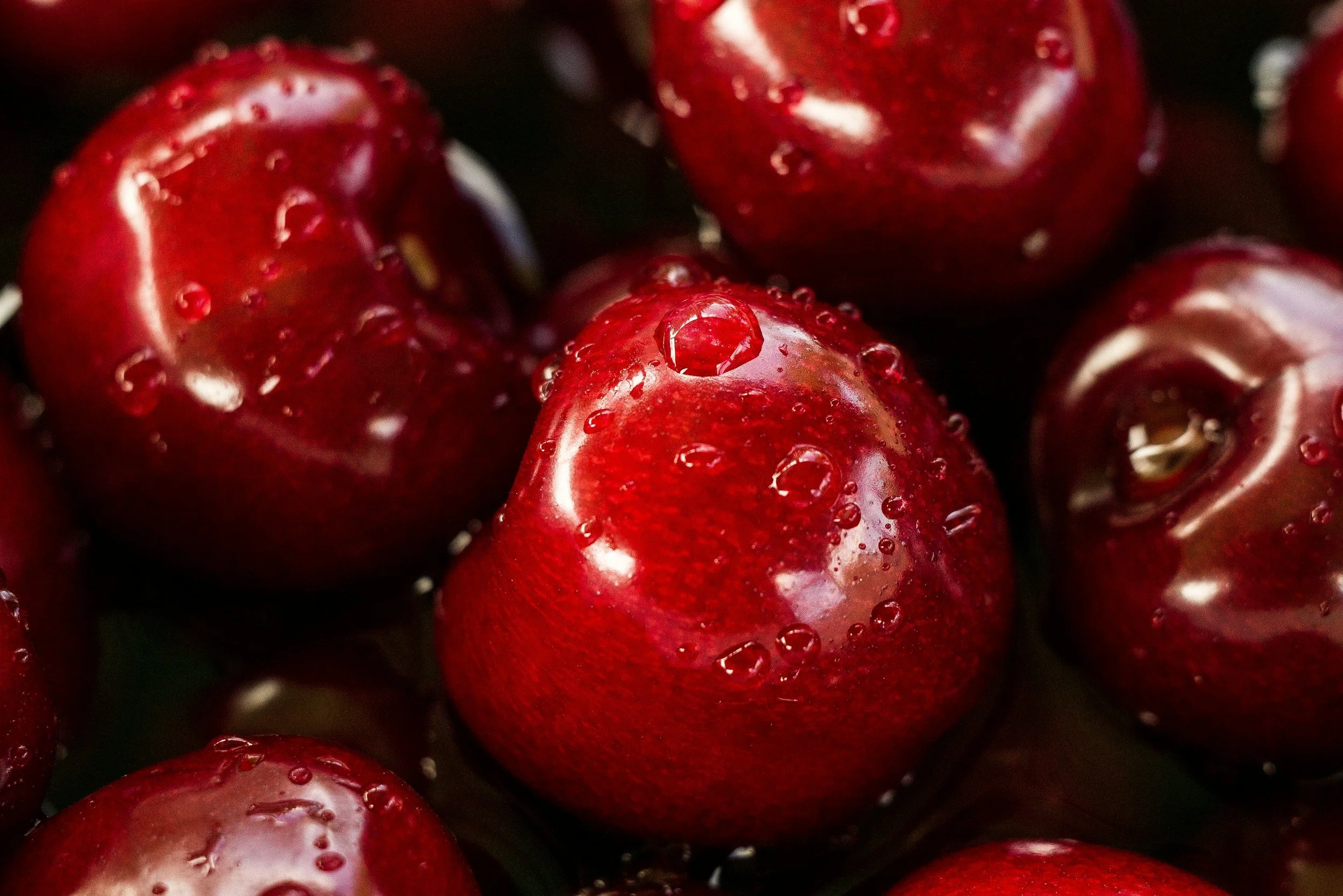
Red is a bold and fiery color that grabs attention. It exudes energy, excitement, and passion. Think of Coca-Cola's iconic red logo, instantly recognizable and synonymous with a refreshing, invigorating drink. Red can also imply urgency or importance, making it a good choice for call-to-action buttons or sale signs.
Orange, a close relative of red, shares some of its energetic properties. It injects a dose of optimism, motivation, and playfulness. Think of Nickelodeon's vibrant orange logo, perfectly reflecting their commitment to delivering fun and engaging content for children. Orange can also represent affordability and value, making it a strategic choice for budget-friendly brands.
The Uplifting Yellows and Sophisticated Purples

Yellow is the color of sunshine and sunflowers, symbolizing happiness, optimism, and creativity. Ikea is known for their bright yellow branding, reflecting their cheerful and welcoming stores. However, be mindful that too much yellow can be overwhelming, so use it strategically as an accent or highlight. However, mixing yellow with another color can drastically change what the consumer is thinking. Hint: McDonald’s. The yellow drives a sense of urgency is the customer (fast food) but the red can trigger the feelings of hunger.
Purple has a rich history, traditionally associated with royalty and luxury. Today, it leans towards creativity and innovation. Think of Hallmark's use of purple, conveying a sense of elegance and thoughtfulness well-suited for their greeting cards and gifts. Purple can also evoke a sense of mystery or intrigue, making it a good choice for beauty brands or tech companies launching a new product.
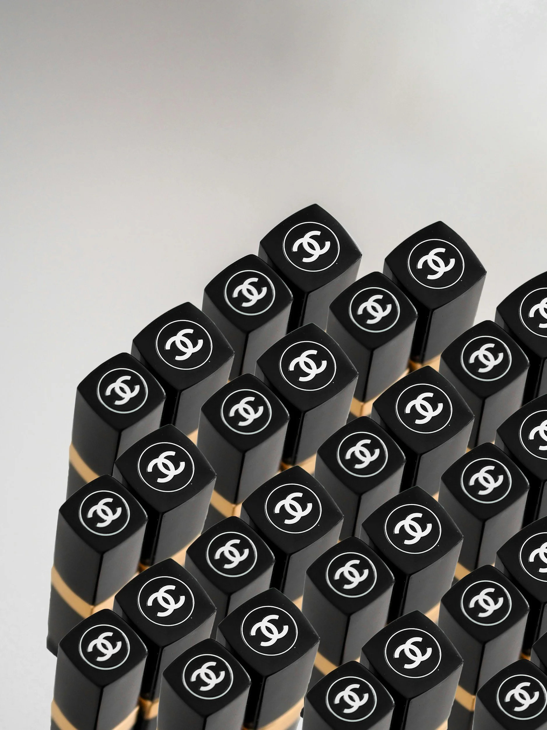
The Playful Pinks and Timeless Blacks
Pink is often associated with femininity, sweetness, and gentleness. Number one example: Barbie. Barbie's enduring pink branding, perfectly aligned with their target audience of young girls. However, pink can also be used to convey youthfulness, fun, and energy, making it a versatile choice depending on the shade.
Black is a color of sophistication, power, and elegance. For example, Chanel's iconic black packaging is instantly recognizable as a symbol of luxury fashion. Black can also be used to create a sense of mystery or exclusivity, making it a good choice for high-end products or services.
Good Ol’ Neutrals (Grays, Browns, Beiges):

Neutral colors offer a sense of simplicity and versatility. They can be used to ground bolder colors in a palette or create a more minimalist aesthetic.
Neutral colors provide a clean and understated foundation, allowing other design elements like typography and imagery to take center stage. They can be easily integrated with a wider range of brand personalities, from sleek and modern to classic and sophisticated.
They can also act as a calming influence and can help balance out more vibrant or contrasting colors in a palette. They can be used to create a sense of harmony and visual hierarchy, directing the viewer's eye towards the most important elements of the design. For example, a logo with a bold red primary color might benefit from a neutral gray background to prevent it from overwhelming the viewer.
The Use of Contrasts and Complementary Colors:
Colors can be used strategically to create visual interest and evoke specific emotions:
Creating visual interest with contrasts: Juxtaposing contrasting colors on the color wheel (e.g., red and green, blue and orange) creates a dynamic and eye-catching effect. This approach can be ideal for grabbing attention or adding energy to a design. For instance, a fast-food restaurant might utilize a contrasting red and yellow color scheme to stimulate the appetite and create a sense of excitement.
Utilizing complementary colors for harmony: Complementary colors sit opposite each other on the color wheel (e.g., blue and orange, yellow and purple). When used together, they create a balanced and harmonious effect. This approach can be suitable for creating a sense of professionalism or trust in a brand identity. For example, a financial services company might choose a complementary blue and yellow color palette to convey stability and reliability.
Examples of effective color combinations: The effectiveness of a color combination depends on the specific context and brand message. Here are some inspiring examples:
Red and white: This classic combination often signifies energy, boldness, and purity. Think of Coca-Cola's iconic branding.
Blue and green: Evokes feelings of peace, growth, and nature. Perfect for environmental or wellness brands.
Yellow and black: Creates a striking contrast, ideal for grabbing attention. Think of taxi cabs or warning signs.
Purple and gold: Represents luxury, creativity, and sophistication. A good choice for high-end jewelry brands.
Choosing the Right Colors for Your Brand
Now that you understand the emotional impact of different colors, it's time to translate that knowledge into action. Here are some tips to consider when choosing your brand colors:
Target Audience: Who are you trying to reach? Understanding your ideal customer's demographics and preferences will guide your color selection.
Brand Personality: What emotions and values do you want your brand to represent? Choose colors that align with your brand message.
Industry Standards: Certain colors have become synonymous with specific industries. For example, green is often associated with healthcare, while blue is commonly used in finance.
Color Harmony: Don't overwhelm your audience with a rainbow. Choose a primary color scheme with complementary or analogous colors for a cohesive look.
Do's and Don'ts of Color Choice in Branding

Choosing colors for your brand is an exciting step, but it's important to be strategic. Here are some do's and don'ts to keep in mind:
Do:
Do your research: Dive deeper into color psychology and explore resources like Pantone's color trends or Adobe Color for inspiration.
Consider cultural nuances: Color meanings can vary across cultures. Be mindful of your target audience's location and background.
Test your palette: Don't just rely on theory. Mock up your logo and branding materials with different color combinations to see how they work visually.
Get feedback: Ask colleagues, friends, or potential customers for their impressions of your chosen colors.
Use color psychology strategically: Don't be afraid to experiment with unexpected color combinations to create a unique brand identity. For example, a tech company could use a combination of calming blue and energizing orange to represent both stability and innovation.
Don't:
Follow trends blindly: While trends can be inspiring, prioritize colors that align with your brand's core values.
Use too many colors: A maximum of 3-4 colors is ideal for a cohesive brand identity.
Ignore accessibility: Ensure your color choices create enough contrast for people with visual impairments.
Neglect the power of white space: White space allows your chosen colors to breathe and creates a sense of balance.
Underestimate the importance of consistency: Maintain consistency in your color palette across all branding materials, from your website to your social media presence.
Real-World Color Magic
Let's see how some successful brands leverage color psychology to their advantage:
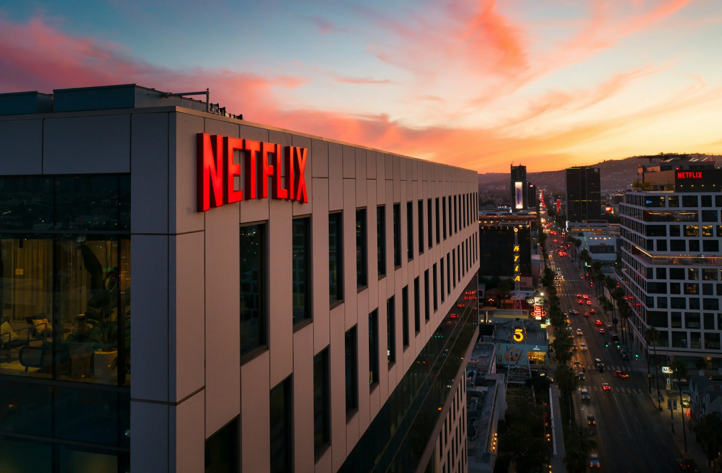
Netflix: The streaming giant uses a bold red and black combination. Red signifies excitement and keeps viewers engaged, while black adds a touch of sophistication.
Tiffany & Co.: Their signature robin's egg blue evokes feelings of luxury, calmness, and trust, perfectly aligned with their high-end jewelry brand.
McDonald's: The iconic red and yellow color scheme is designed to be visually stimulating and trigger cravings. Red signifies excitement, while yellow adds a touch of playfulness.
Color psychology is a powerful tool that can elevate your brand identity and connect with your target audience on an emotional level. By understanding the language of colors and applying the tips in this article, you can create a brand that resonates with your customers and leaves a lasting impression. Remember, color is just one element of successful branding, but it plays a crucial role in shaping perception and influencing behavior. So, choose your colors wisely, and watch your brand come alive!
Need Help?
Choosing the right colors is just one step in crafting a powerful brand identity. If you're feeling overwhelmed by the branding process, don't hesitate to reach out to a professional. At Robles Designs, we specialize in helping businesses create unique and impactful brands that resonate with their target audience.
We can assist you with:
Brand strategy and development
Logo design
Color palette selection
Visual identity creation
Marketing materials design
Contact Robles Designs today and let us help you unlock the full potential of your brand!